|
When it comes to designing an interface,
graphic, anything... there
are many overlooked things to consider. You want a design that's
attractive, pleasing and pleasant to look
at.
|
|
|
|
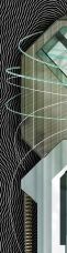
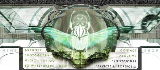
These show the steps and different styles I went through
until deciding on my final interface. Focusing on color and the interface
matching well with my sites colors this is what I went through.
|
|
 1 1
|
|
 2 2
|
|
 3 3
|
|
 4 4
|
|
 5 5
|
|
 6 6
|
|
 7 7
|
| 1: This is the basic style I was going through. I
hadn't decided on textures yet so I kept it simple. |
| 2: I added the colors and buttons, but the colors weren't
balanced out the way I wanted. |
| 3: I took out some of the color, hoping it would give it
a more attractive look. |
| 4: I put the color back, but this time I changed the
buttons colors to make them mellow. |
| 5: I decided to make the buttons have full text on them.
The loading time for all of those rollovers would have been too
much. |
| 6: I got rid of all the distracting colors, and gave it a
darker brawnier style to match my site. I was happy with this
version. |
| 7: The final version with buttons and all, I was finally
happy with it. |
|
|
|
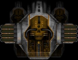
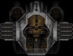
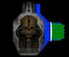
As you can see below, Bright colors can make an interface
distracting. The first image is the interface with enhanced colors. Yes it
might look good if you have a lively site, but not for mine. The second
image is how it looked with toned-down colors.
|
|
|
|
|
|
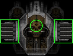
After creating the center piece I then planned out where
the buttons would be.
|
|
|
|
This next image shows the focus points I was trying to
imply, The center of course was meant to draw attention, then the buttons
were secluded to also give a clean non-cluttered image.
|
|
|
|
You do not want to add too much detail outside of the
focus point, doing so will distract the eye and will result in a messy,
cluttered interface.
|
|
So when designing, keep in mind that there should be a
focus point,
colors and detail that won't distract from it, and a nice
layout :)
|
|
Hope that helps! |
|
|